Wednesday, August 31, 2011

Oops

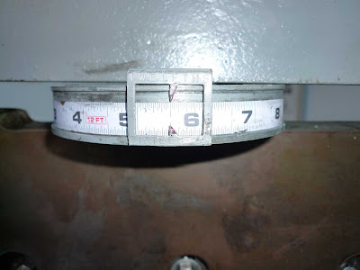
Guillotine ruler

I've been spending the last few weeks prepping like crazy for the SF Zine Fest on Labor Day weekend. I've made a ton of stuff and I thought I was ready to start ordering envelopes for everything. Then I realized that I had made a lot of my stuff in photo sizes, like 4x6", which is not a standard stationary size.

Untrimmed 4x6" cards

Luckily, I had room to spare on most of the cards so every day I've been bringing a box of items to work (the San Francisco Center for the Book) to do trim off the edges.

Trimmed cards

I was really disappointed when I first learned of my silly mistake but now I will be sure to make my items fit an envelope instead of just assuming it's fine.


Sunday, August 28, 2011

Big Top Etching

Big Top etched plate

I first learned, and fell in love with, etching in the summer of 2004. Being a photo major in college, I didn't have time to do much etching (besides photogravure) over the past 7 years. 
Etching tools and unworked zinc plate

I decided to take an intaglio course at City College of San Francisco this semester and after only two classes, I am once again in love with the process.

First round Big Top print

My choice of subject matter came from a thought I had at work one day: If I had a circus, what would it look like?

Second round Big Top print

Admittedly, I'm not the most skilled at drawing and lately I have been doing whimsical drawings in a more simplistic style. I thought this would work great with my chosen subject matter.

Third round Big Top print

It took three rounds of reworking the plate, each time adding more texture, shading and grass to get the print above, which I'm quite happy with. I'm hoping to have enough time to make one or two more circus related plates before we move on to the next project and next semester I'd like to make a portfolio of my version of the circus.


Sunday, August 21, 2011

Handwriting Typography Round 2

Handwritten book colophon

Friday was the second, and final, session of my handwriting as typography workshop at the San Francisco Center for the Book. Our project was creating a small book from a 500 word prose in our own handwriting. 
Chapter II of Through the Looking Glass

My prose was an excerpt from Chapter II, The Garden of Live Flowers, in Lewis Carroll's Through the Looking Glass. As most people know, both Alice in Wonderland and Through the Glass are mainly composed of dialog which, it turns out, is quite hard to layout in handwriting. Our instructor, Georgianna Greenwood, helped me decide to make the dialog run-on so it would look like prose and be easier to layout.

Ruling pages

Before we could get down to writing, we had the tedious task of ruling all the pages. 

Cover

I was thrilled to see the flower and paisley print cover paper Georgianna chose. It fit my prose perfectly.

Opening/half title page

The first page you see when you open a book is called a half title or dedication page. Because my excerpt began in the middle of a chapter, I chose to use the first sentence of the chapter instead.

Title page

My title page came out a little crooked, it's hard to center your handwriting when you don't have a computer.

Title image

Title image and chapter opening spread

There is often a title image or ornament next to the chapter opening,traditionally on the right. I chose to do a line drawing of a house and garden for the title image because, in the beginning of The Garden of Live Flowers, Alice tries to get to the garden but keeps being lead back to a house. 

Double page spread

It's hard to tell from the picture but, every time the flowers speak, the text changes to green. I did this to make the run-on dialog a bit easier to understand.

This book wasn't perfect but it gave me many ideas for future art projects, especially because I love writing and literature so much.


Saturday, August 13, 2011

Handwriting Typography


Yesterday I had my first session of a handwriting to typography workshop at the San Francisco Center for the Book. The class is taught by calligrapher Georgianna Greenwood. The workshop is challenging and incredibly interesting and focuses on learning to be more consistent with your handwriting so that you can work it into your art. 

Handwriting sample for beginning of class

We had to bring a handwriting sample to class and I chose to rewrite my favorite part of Jane Eyre. It was determined that while my handwriting was the most legible, it was also the most inconsistent. Georgianna politely blamed my inconsistencies on exciting and emotional prose I chose to copy.


Work table with notebook, materials and tools

We began the day with a brief history of typography and fonts, which, in case you didn't know, used to be developed by hand. Then we tested out the materials we'd be using: 2 sizes of Micron pens, a thick Faber-Castell pen, and a Speedball pen with antique nib and India ink. I was surprised to find that the pen, nib and ink were easiest to use and they soon became my favorite.

Practice

More practice

We did a lot of practice, testing out various writing sizes and different tools. I needed the most practice because, like most people under 30, I was not taught handwriting in school. That being said, my handwriting is somewhat childish and I fell in love with it at larger sizes. I guess maybe because it's not a subtle way of writing and large things are not subtle.

Handwriting specimen

Our goal for the first day was to create a type specimen of our own handwriting. A type specimen is a sheet in one font showing every letter in both upper and lower case as well as lining numbers (the contemporary way to depict numbers), old style numbers (my favorite), and punctuation. My specimen isn't amazing but I think my writing came a long way in just 7 hours. I'm very excited for next Friday's session where we'll hand write a 2 page spread of a selection of prose of our choosing.


Monday, August 8, 2011

Vintage Yard Sale Finds


I recently discovered that,like myself, my friend Vanessa loves all things vintage,so I was thrilled to find out she was having a yard sale. Admittedly, I was lazy and slept through the beginning of the sale, missing out on some treasure. I made it over before noon and was able to find some gems.
I think my favorite items are these old books. I clearly have an obsession with books and thought these were amazing. There's Life Long Ago which I was initially drawn to because of the Stegosaurus on the cover but found out it contains some great old fossil photos and drawings, a Victorian interior design book, one volume of the 13th edition of the Encyclopedia Britannica and a Prentice-Hall World Atlas. Besides looking through these books for inspiration, I'm thinking they will be great to use in collages and mail art projects, though it still makes me a little queasy to think about cutting them up.

I also found some nice clothes, like this pink, bracelet sleeved jacket. I thought it might be too tight but ended up being a perfect fit.

             
I have been trying to get more into dresses of late. If they come below the knee, they are not too short to bike in and they can be more comfortable than skinny jeans. Plus, I thought I should at least start looking more like a grown-up, even if I don't act like one. The green patterned dress on the bottom is perfect straight off the hanger. I need a slip for the one on the top but, with the plethora of vintage shops in San Francisco, I should be able to find something that works.

And lastly, the one item I got that I actually needed: this awesome 3-way lamp. I have been meaning to replace the falling apart floor lamp in the bedroom so I was delighted to find this bright and stylish one.